General operation
Input foreground and background colors by:
- Entering a hexadecimal color (e.g. 0024A7)
- Entering red, green, and blue (e.g. 0 36 167)
- Entering hue, saturation, and value (e.g. 227 100 65)
- Adjusting the sliders:
- Move a slider with your mouse (or finger on a touch screen)
- Click your mouse or tap your finger to the left or right of a slider (will move the slider one step)
- Use the left and right arrow keys (after having clicked or touched a slider)
Evaluating the contrast

The original 1999 accessibility guidelines for websites recommended minimum differences in color and brightness to insure sufficient contrast between text and background colors (Techniques For Accessibility Evaluation And Repair Tools from April 2000).
In 2008, the guidelines were updated to evaluate contrast using relative luminance following ISO and ANSI standards (ISO 9241-3 & ANSI/HFS 100-1988). This resulted in a slightly lower visual (color & brightness) difference in the colors as the recommended minimum.
User selectable Good|Okay|Poor
The ranges for Good|Okay|Poor are user selectable using a dropdown menu. The Good|Okay|Poor ranges can be selected from:
| WCAG 1.0 Guidelines |
WCAG 2 AAA Compliant |
WCAG 2 AA Compliant |
|
|---|---|---|---|
| Good | Color diff. >= 500 Brightness diff. >= 125 Contrast ratio >= 7.0 |
Contrast ratio >= 7.0 | Contrast ratio >= 4.5 |
| Okay | Contrast ratio >= 4.5 | Contrast ratio >= 4.5 | Contrast ratio >= 3.0 |
| Poor | Contrast ratio < 4.5 | Contrast ratio < 4.5 | Contrast ratio < 3.0 |
The webpage will remember the Good|Okay|Poor setting using the browser’s local storage function.
Contrast Reminder – If you do select a lower contrast level setting, the webpage will remind you of the lower setting every time the webpage is loaded.
To disable the reminder (if you find it annoying and aren’t worried about using the wrong setting by accident) uncheck the selection box below:
The older, more stringent 1.0 guidelines are helpful when evaluating text to be used in a presentation (the reason this tool was built). For web design, the WCAG 2.0 AA & AAA guidelines provide practical levels of contrast, and now the tool can be configured to indicate Good|Okay|Poor based on the current guidelines.
WCAG 2.0 web accessibility guidelines

- WCAG 2 AAA Compliant – Contrast ratio >= 7.0
- WCAG 2 AAA Compliant (18pt+) – Contrast ratio >= 4.5
- Text with AAA compliant contrast can generally be read everyone with the exception of people who use assistive technologies (e.g. screen readers)
- WCAG 2 AA Compliant – Contrast ratio >= 4.5
- WCAG 2 AA Compliant (18pt+) – Contrast ratio >= 3.0
- Text with AA compliant contrast can be read by most people, although people with some types of color blindness and some people over 80 years old may find the text difficult to read
Clarifying about 18pt+ (18 point or larger)
The WCA Guidelines specify different minimum contrast ratios for fonts that are 18 point or larger (or 14 point or larger if the text is bold). The standard is defined using points, which are the typographical measure of text size, rather than pixels.
In typography, 1 point equals 1/72 of an inch (0.3258mm), so an 18 point font would have a 0.25” tall space. Typically, computer displays have in the range of 96 to 130 CSS pixels per inch, which works out to a CSS font-size of 24 to 32 pixels for an 18 point font. The W3C Success Criteria for contrast suggests a CSS font-size of 24 pixels as the equivalent of 18 point text.
Point size refers to the space within which a character fits. Not all fonts are designed the same. Some fonts at a 24 pixel size look smaller than others. If using a font that looks smaller than other fonts, the size should be larger than 24 pixels (or have more contrast).
Alpha opacity
Opacity (transparency) for the foreground color can be set by entering a percentage (0 to 100) or by adjusting the slider.
The opacity setting supports Google’s Material Design recommendation to use white or black text with the opacity based on the importance of the text, rather than using light gray or dark gray as the text color (the common practice for websites). The slight transparency gives the text a similar shade to the background color, which is easier to read than gray text over a colored background.
Google recommends opacity settings of:
| Category | White | Black | White | Black |
|---|---|---|---|---|
| Important text | 87% | 87% | 87% | 87% |
| Secondary text | 60% | 60% | 60% | 60% |
| Disabled & hint text | 38% | 38% | 38% | 38% |
Drag & Drop color storage
The Drag & Drop area stores colors. (Helpful if you have several text and background colors you want to evaluate.)

To save a color in the Drag & Drop area, position your mouse over the Foreground or Background color sample. Hold down the left mouse button, and then move the mouse to one of the storage cells. Releasing the mouse button when over a storage cell will save the color.
To return a saved color to the checker, position your mouse over the desired cell, hold down the left mouse button, and move the color to the Foreground or Background color sample area.
Dragging & Dropping also works with tablets and PCs with touch displays.
Color Wheel tool
Clicking one of the five color combination buttons will display contrasting colors based on the HSL value of the top most color in the Drag & Drop area. Clicking the highlighted combination button (the button with a red border) will restore the prior color set.

Combinations based on the color wheel are a suggestion only. While colors based on the wheel are generally compatible, that is not always the case.
When run on a tablet, laptop, or PC size display, this app has a function to save colors and drag those colors back to the fore and back ground selectors.
Exchanging color information
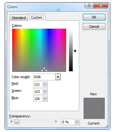
Colors for programs like Microsoft PowerPoint™ are typically specified in RGB or HSL format. Macs now support HEX color codes and Windows has support for HEX in its Office Insider versions, which should be available for users of the latest Office products in the near future.
Microsoft Office™ Color Information

Obtaining color information for items like slide backgrounds may require a three-step process:
- Use the Print Screen function to capture an image of the background
- Paste the screen capture into a graphics program (e.g. Microsoft Paint™, Photoshop™, GIMP™, etc.)
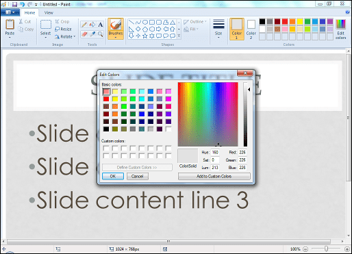
- Use the graphics program’s Color Picker function to get the color information
Microsoft Paint™ for picking colors

RGB versus HSV for color selection
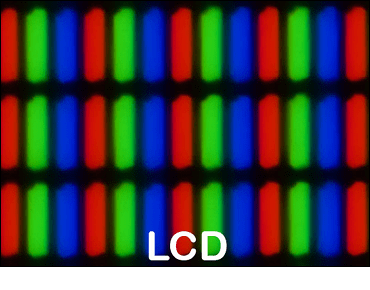
Computers display colors by controlling the intensity of the red, green, and blue LCDs in the screen.
 Image source: Wikipedia
If the red, green, and blue crystals are all off, then that area of the display appears as black. If the three crystals are fully on, then that area of the display appears as white. Differing levels of each color changes the perceived color on the screen.
Computers use a six digit hexadecimal value to define a color, two digits for each of the three colors. A two digit hexadecimal value can define 256 levels (0 to 255). While computer systems work in hexadecimal values, people are more comfortable using decimal values (0 to 9), which is probably why most applications use three decimal values for inputting color values.
We do not think about colors in terms of how much red, green, or blue is used. We thing about colors in terms of hue (the color, such as red or yellow), saturation (how much color there is), and value (how strong the color is). This is why using the HSV sliders can be easier for adjusting colors than the RGB sliders.